This means only 20% of top-of-funnel users come back to use your product in a meaningful way – highlighting the weighted importance they have on your business metrics.
Furthermore, with increasing competition in SaaS alongside tool fatigue, first impressions are increasingly paramount to converting, retaining, and expanding your customer base. And where these impressions typically first start to form is within your product led growth onboarding experience.
But despite this importance, onboarding experiences are often overlooked as a one-time checklist – often remaining stale despite your product's continued evolution.
As a result, many product led onboarding experiences regress to become overly complex, laden with friction and murky at conveying benefits to end users.
And we're no strangers to this at Supademo, where we struggled with a pattern of less-than-ideal customer activation, slow time-to-value, and low onboarding completion. So in an effort to improve these metrics, we implemented a series of tactics to reduce friction and accelerate time-to-value.
These tactics helped us:
• Increase our activation rate by 20%;
• Decrease the time it took to achieve the "aha! moment" by 39%;
• Increase our Supademo-per-user based on cohorts
With these outcomes in tow, we wanted to compile the series of tactics we implemented and how we measured success — with the aim of helping other startups iterate on product onboarding challenges.
Read below for our in-depth, practical guide 🫡
Why you should constantly optimize your product-led onboarding experience
If you're building a self-serve, product-led software experience, you should be reviewing and optimizing your onboarding flow at least once per quarter. And while that might seem excessive, there are rational reasons why you should do this:
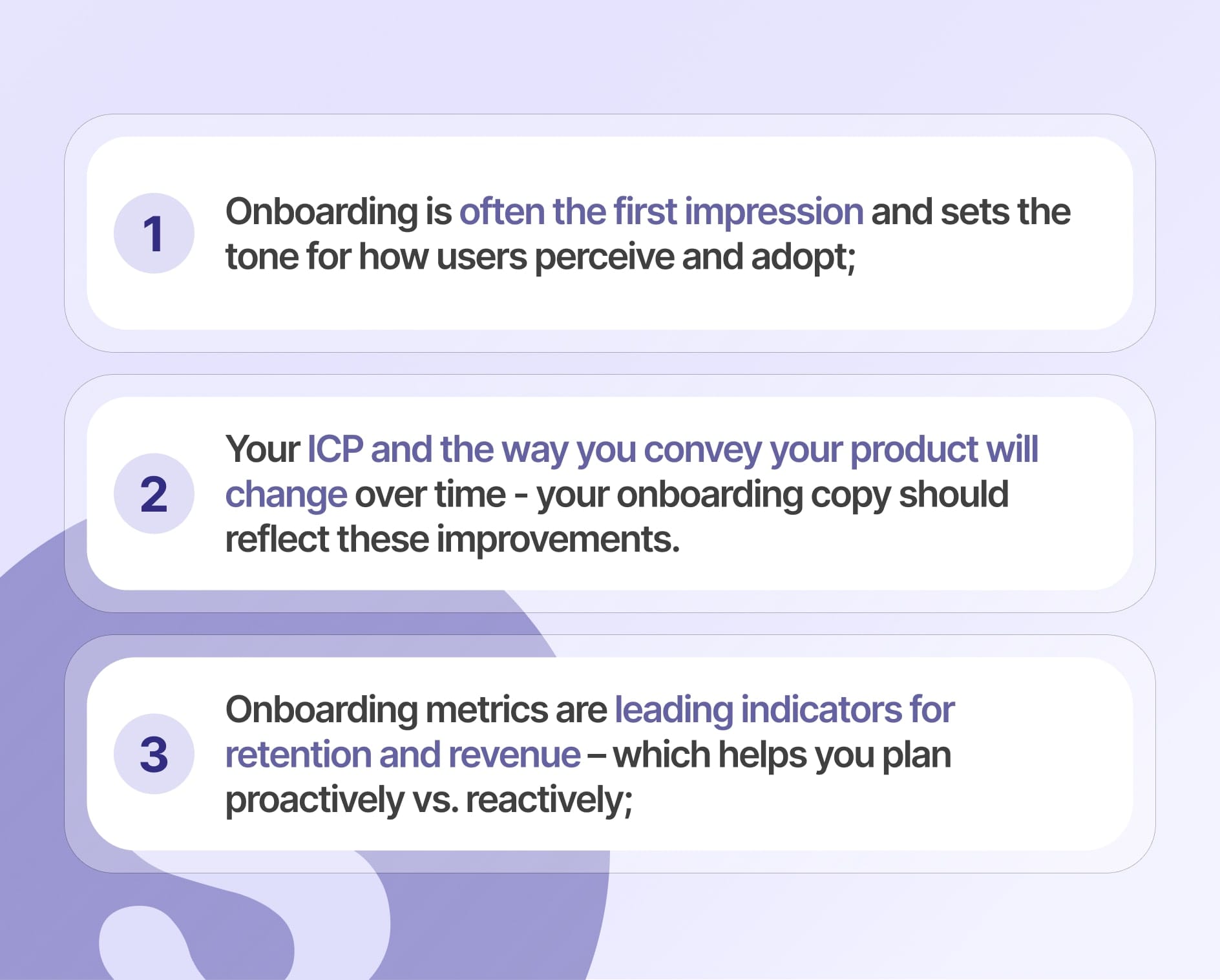
- Aside from your website, the product onboarding experience is typically the customer's first impression and sets the tone for how they perceive and adopt your product;
- With time, you'll get better at communicating your benefits and narrative. And your onboarding copy should reflect these learnings/improvements.
- Your ideal customer profile (ICP) may evolve with time. For instance, you might move upstream to enterprise customers or move downstream to unlock self-serve signups. Onboarding length, steps, and content should be personalized based on your ICP.
- As you add new features to your product, its "Aha! moment" may shift;
- Onboarding metrics such as activation are a leading metric that can help forecast user retention and recurring revenue – helping you be proactive rather than reactive;
Common SaaS onboarding metrics you should measure
While metrics can differ based on the industry, customer persona, growth motion (PLG, Sales-led, Sales-assisted), and annual contract value (ACV), here are some common ones typically measured by B2B SaaS companies:
Trial to Paid Conversion Rate
The percentage of free trial users who become paying customers after the trial period ends.
For B2B SaaS companies with a relatively new product, a trial to paid conversion rate between 15-30% is considered excellent.
Time to Value (TTV)
The time it takes for a new customer to realize the expected value of the product and reach their "Aha!" moment.
For B2B SaaS companies, the median time-to-value is around 30 days, with top performers at under 7 days.
Onboarding Completion Rate
The percentage of customers who complete the entire onboarding process.
For B2B SaaS companies with a PLG model, an onboarding completion rate between 40-60% is considered good, with top performers achieving rates as high as 70-80%.
Activation Rate
The percentage of free trial users who pass the threshold of a desired action (i.e. X demos created, Y friends added, Z items sold), ideally within a time-bound period. Since activation rates are specific to your company, the threshold and standard can vary greatly.
A great number for B2B SaaS is considered to be around 30-50%.
Onboarding metrics we measure at Supademo
While we measure all of the above metrics at Supademo, here are the onboarding metrics we care about the most:
- Onboarding Completion: We consider someone to have "completed onboarding" if they've (1) signed up, (2) confirmed their email, and (3) created a workspace for their Supademos.
- Activation Rate: We consider a user to be "activated" or have experienced our core benefits if they (1) completed onboarding, (2) created at least one Supademo, and (3) received an external view by sharing it – all within 7 days.
- Time-to-Value: How quickly the user experienced our core product value – creating their first Supademo.
- Demo per user by cohort: How many Supademos each user creates on average, by signup cohorts (i.e. week 1, week 2). This is a measure of how we're incentivizing users to create (i.e. ease of use, communication).
With that being said, let's now dive into some of tactical changes we made to improve our onboarding metrics.
Five tactics we used to improve our product onboarding experience
1. Time-boxed comparison periods to 2 months prior to changes vs. 1 month after;
2. Leveraged tools like Mixpanel to compare and contrast data by cohorts, free/paid users, and by email types;
3. Jotted down proposed changes, along with hypotheses on how it might improve onboarding;
4. Measured and determined whether or not it actually impacted the metrics at large;
In no particular order, here are five key tactics we implemented across our product onboarding:
1) Reverse trial directly into our highest-tier plan
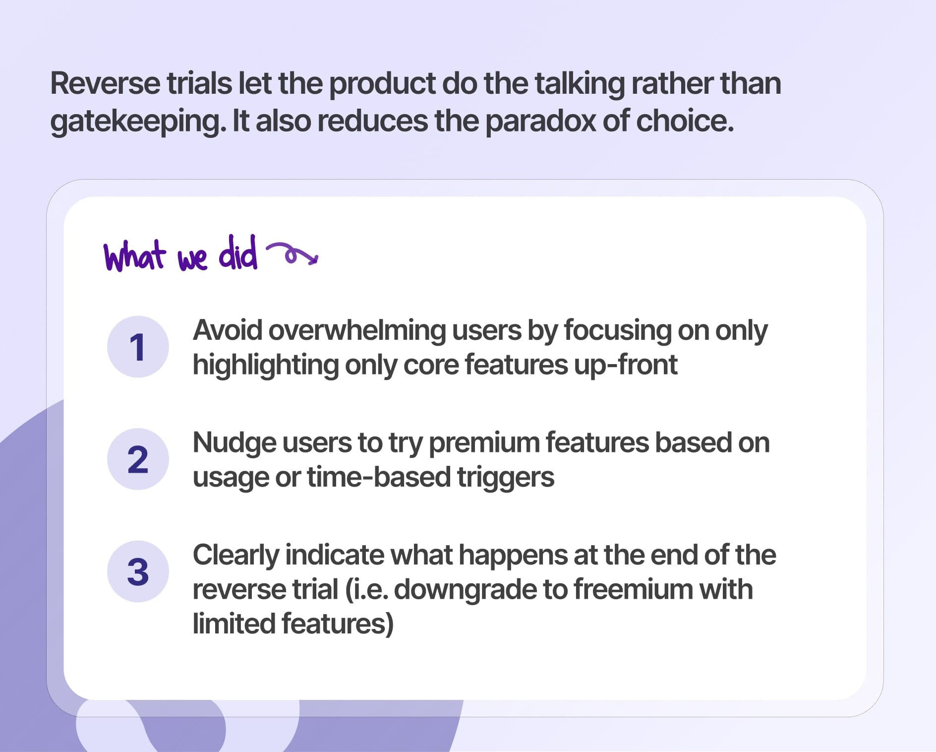
Many companies often find themselves contemplating whether they should offer a free trial or a free plan. Instead of offering one or the other, we starting using reverse trials to offer the best of both worlds.
Instead of nudging customers to opt-in to a higher plan or to enter in a credit card, reverse trials gives customers access to all paid features upon signup, typically on the highest plan.
Companies often find themselves wrestling with the choice between offering a Trial or adopting a Freemium model. My take? Opt for neither, because Reverse Trials are simply.. better.- Elena Verna
We use reverse trials to automatically enroll new signups onto our Scale plan, which includes powerful features like dynamic variables, trackable links, and conditional demo branching that enables viewers to "choose their own journey".
1. Shine a spotlight on our key features through our actual product – not through complex marketing lingo;
2. Customers test drive which plan and features best fit their use case without up-front commitment and paradox of choice;
3. Users better understand our value proposition through visual guidance;
4. Drive feature adoption by encouraging users to learn by doing in a visual, self-paced way;
While reverse trials can be risky as users can consume costly resources (i.e. AI credits) or act maliciously to circumvent paying, we ultimately found it to be extremely effective throughout customer onboarding.
2) Use social proof everywhere
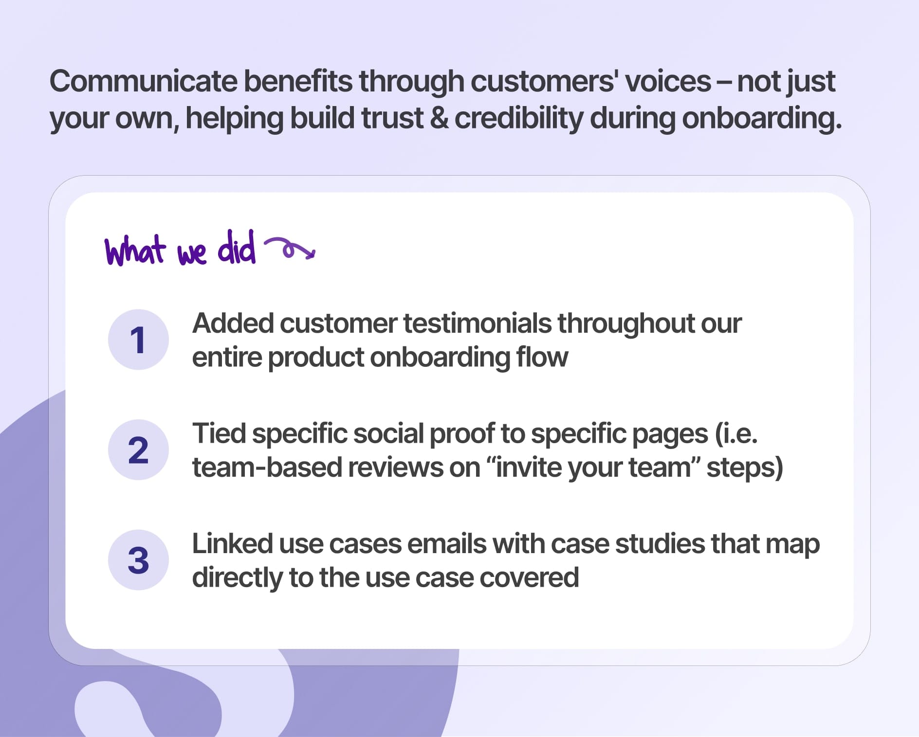
At Supademo, we like to "show, not tell". And the same goes for communicating our benefits through the lense of our customers' voices – not just our own. This helps build trust, credibility, and authority, pushing customers to complete onboarding and invest more time into the product evaluation.
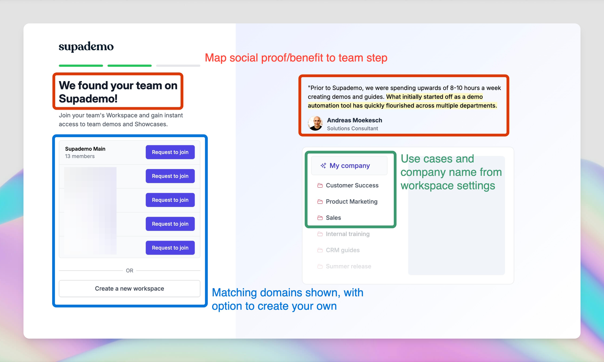
Specifically, we added social proof throughout our entire product onboarding flow – tying specific reviews to specific onboarding screens the user is on. For instance, on the "invite your team" step of the onboarding process, we added a customer review touching on how effective Supademo has been across the entire organization.
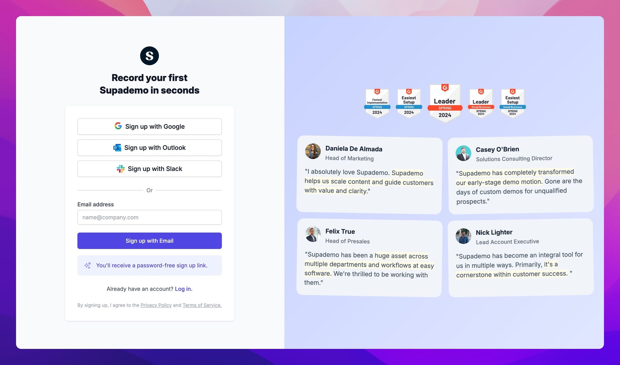
In addition, we drip links to our case studies across our standard onboarding emails and also highlight the ROI our partners have realized on emails triggered by product triggers (i.e. after a user successfully creates 5 demos) – further incentivizing them to dive deeper or explore different use cases, at their moment of inspiration.

Finally, we attach credibility to our reviews by showcasing our G2 Leader badges, alongside links to our Chrome or Product Hunt profiles.
3) Force users to experience our "aha moment"
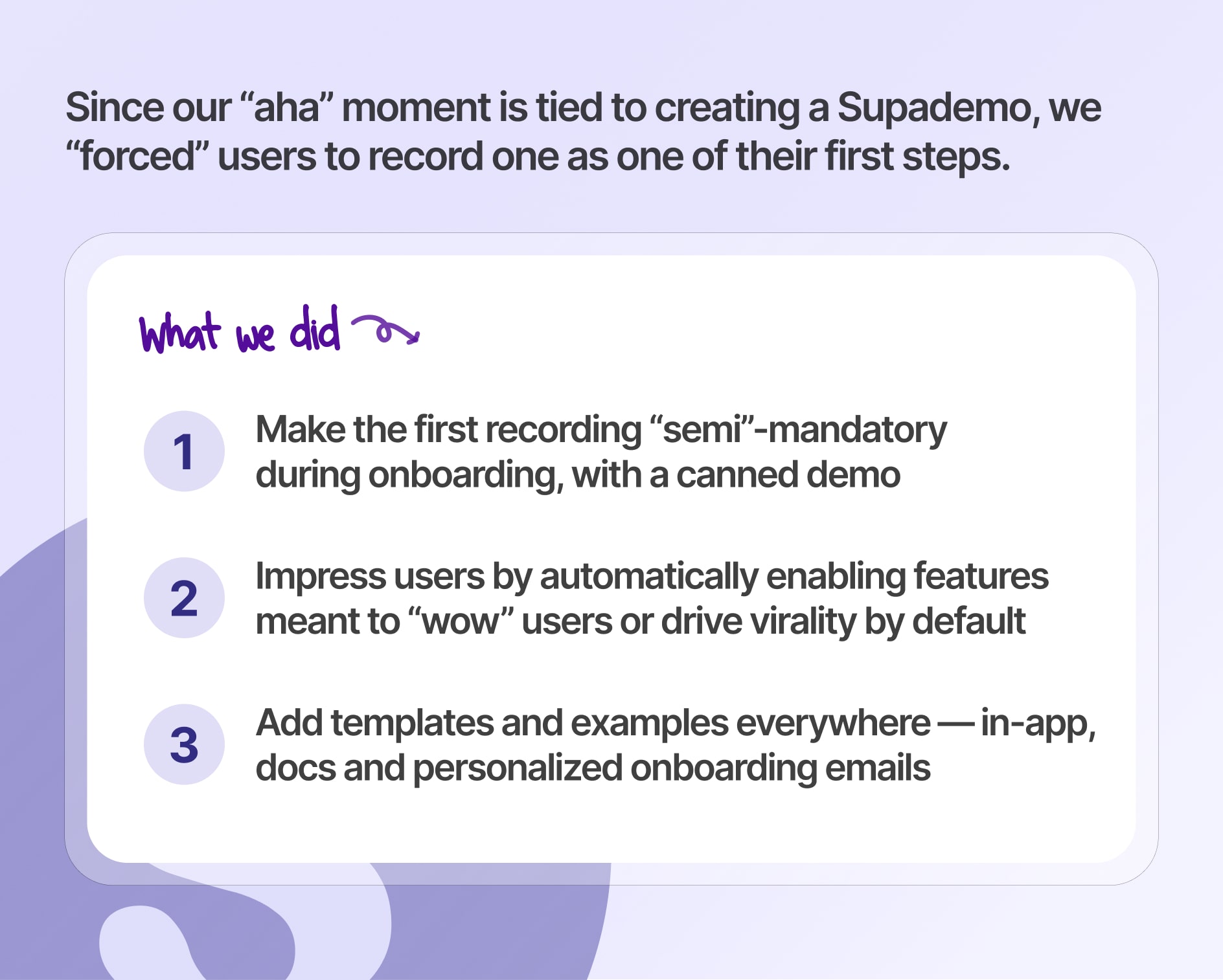
When you're building a complex product with a lot of bells and whistles, it can be unrealistic to expect customers to try every key feature. So we wanted to figure out a way to accelerate their "Aha! moment" by forcing them to record a Supademo, while strategically enabling specific features by default.
Regarding the latter, our aim was to elicit a "wow factor" as part of their first impression of Supademo. Here's a recap of some of the things we did:
A) Make the first recording "semi"-mandatory during onboarding
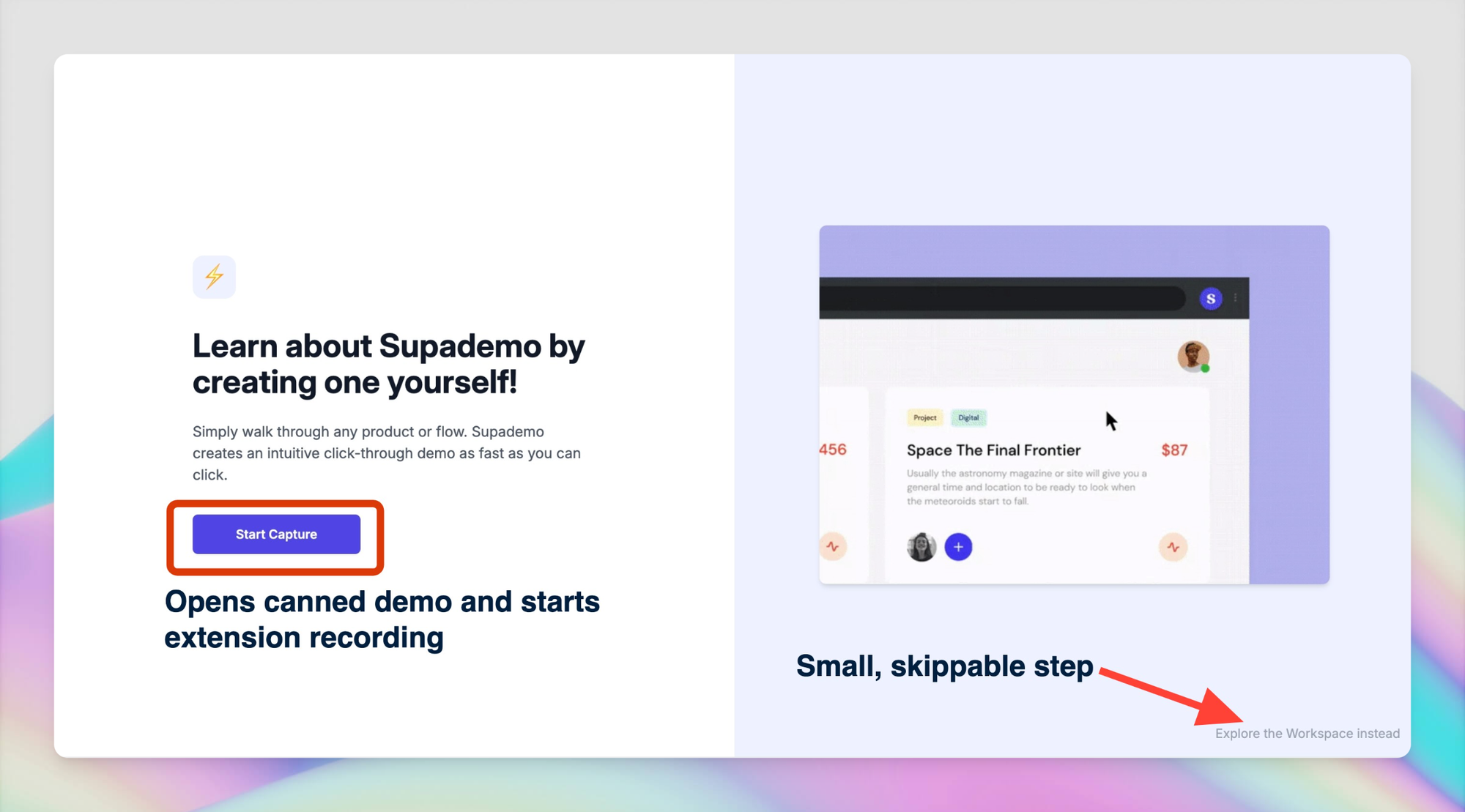
We added – what looks like – a mandatory step in the onboarding process that forces users to record their first Supademo.
Why? We found many users were signing up and not creating a Supademo – often due to a misguided perception that creating a product demo would be tedious and take a lot of time.
But as you can see, this isn't the case 👇🏽
And since Supademo's "Aha!" moment is tied to experiencing how easy it is to create an interactive demo, we wanted to remove the paradox of choice and force users to record a test product demo.
To achieve this, we added an onboarding step that prompts the users to "Try Recording a Supademo".
1. Automatically opens a canned demo created by us;
2. Displays a modal explaining the intent and instructions for the canned demo;
3. Starts the Supademo extension;
4. Routes customers down a linear path with the last step explaining how to stop/end the recording – thereby ensuring everyone ends up on this screen as the last step;
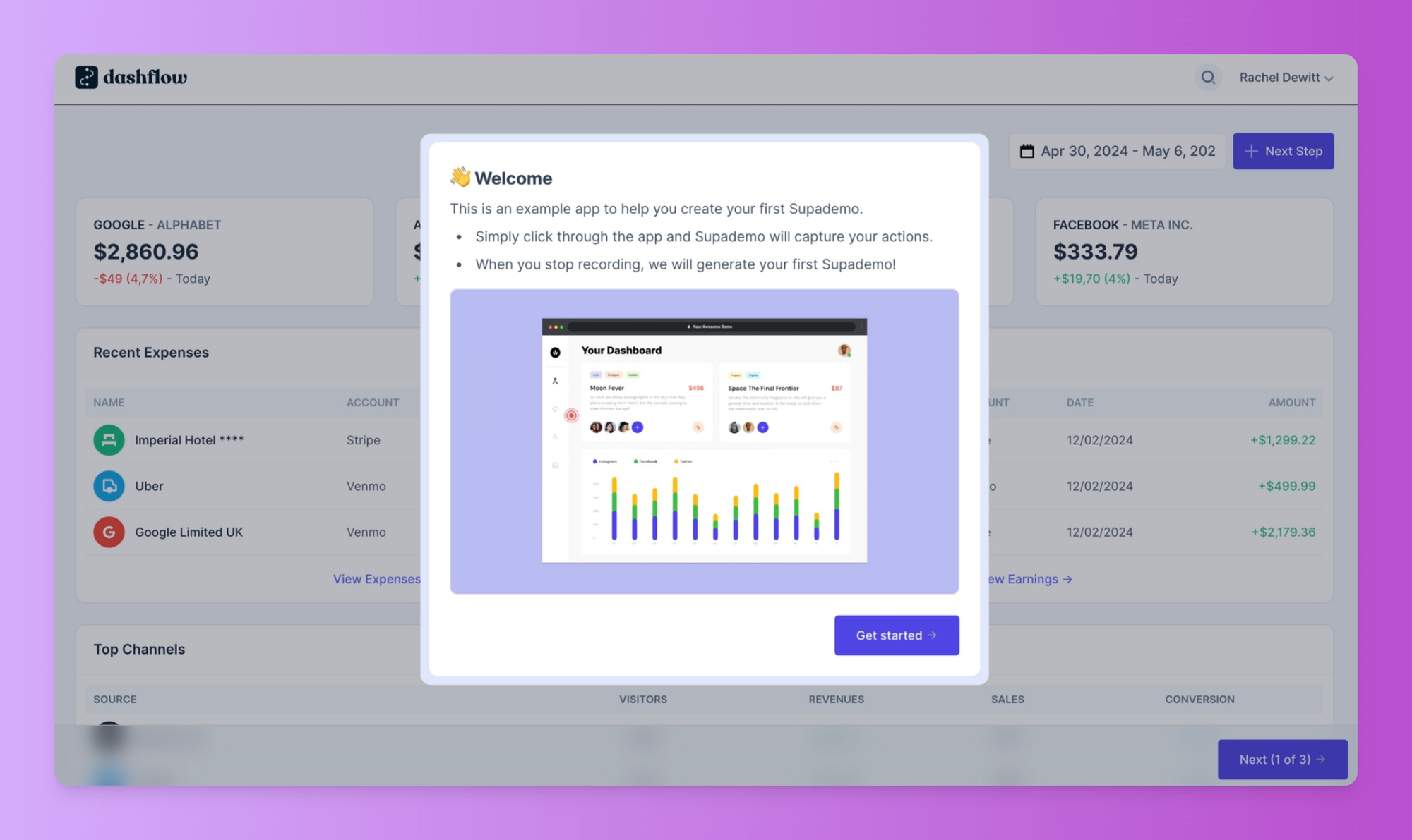
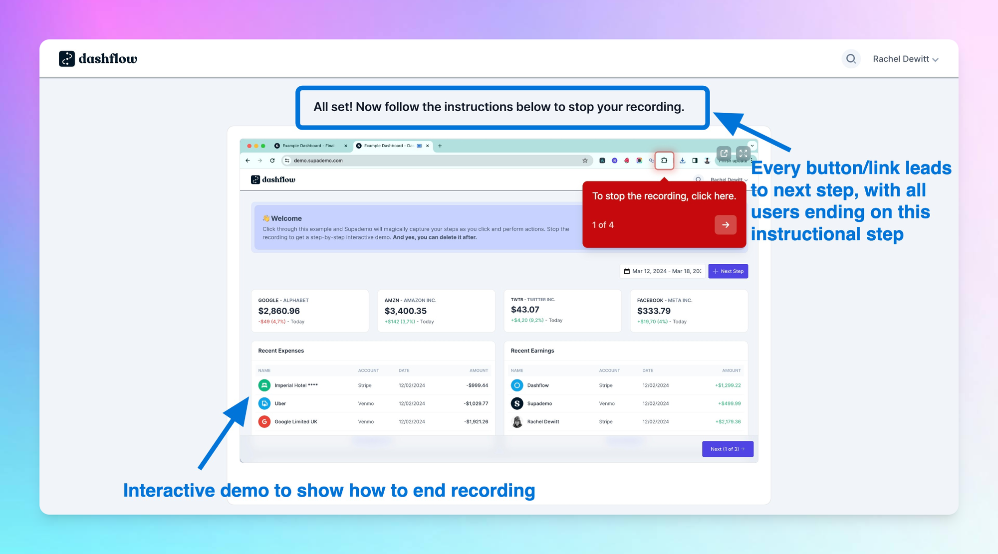
By simplifying/stripping down the demo and funnelling all users to the same final page regardless of what they clicked, we were able to reduce this confusion and analysis paralysis.
B) Enable "wow" features by defaultWe decided to automatically enable zooming and panning effects to add beautiful transitions to Supademos created through the extension. In addition, we added intelligent, automatic text annotations to each step – helping simplify and speed up the demo creation process.
4) Push to invite team members

It's commonly accepted that team-based, collaborative SaaS platforms like Slack tend to have higher retention and lower churn rates than single-user platforms. More users means more surface area for product penetration, wider use cases, and higher odds of creating a champion who can vouch for your product internally.
Hence, we deliberately push new users to invite team members as part of their product onboarding experience. This includes:
A) Automatically show matching workspacesBased on the users' work email, we display workspaces that contain users with the same domain – with an option to request access. We also added an option to let other members from the same work domain join without approval as a free workspace viewer.

B) Encourage users to invite right at their moment of inspirationBased on the hypothesis that most users drop off after the first day, we encourage users to invite their team right at the start – with the goal of maximizing horizontal surface area within their organization.
C) Make invites and approvals one-clickWhen users request access, invite their team members, or try gated premium, we automatically send one-click request and approval emails to bring that user into the shared workspace in a frictionless way.
5) Personalized, action-trigger onboarding emails
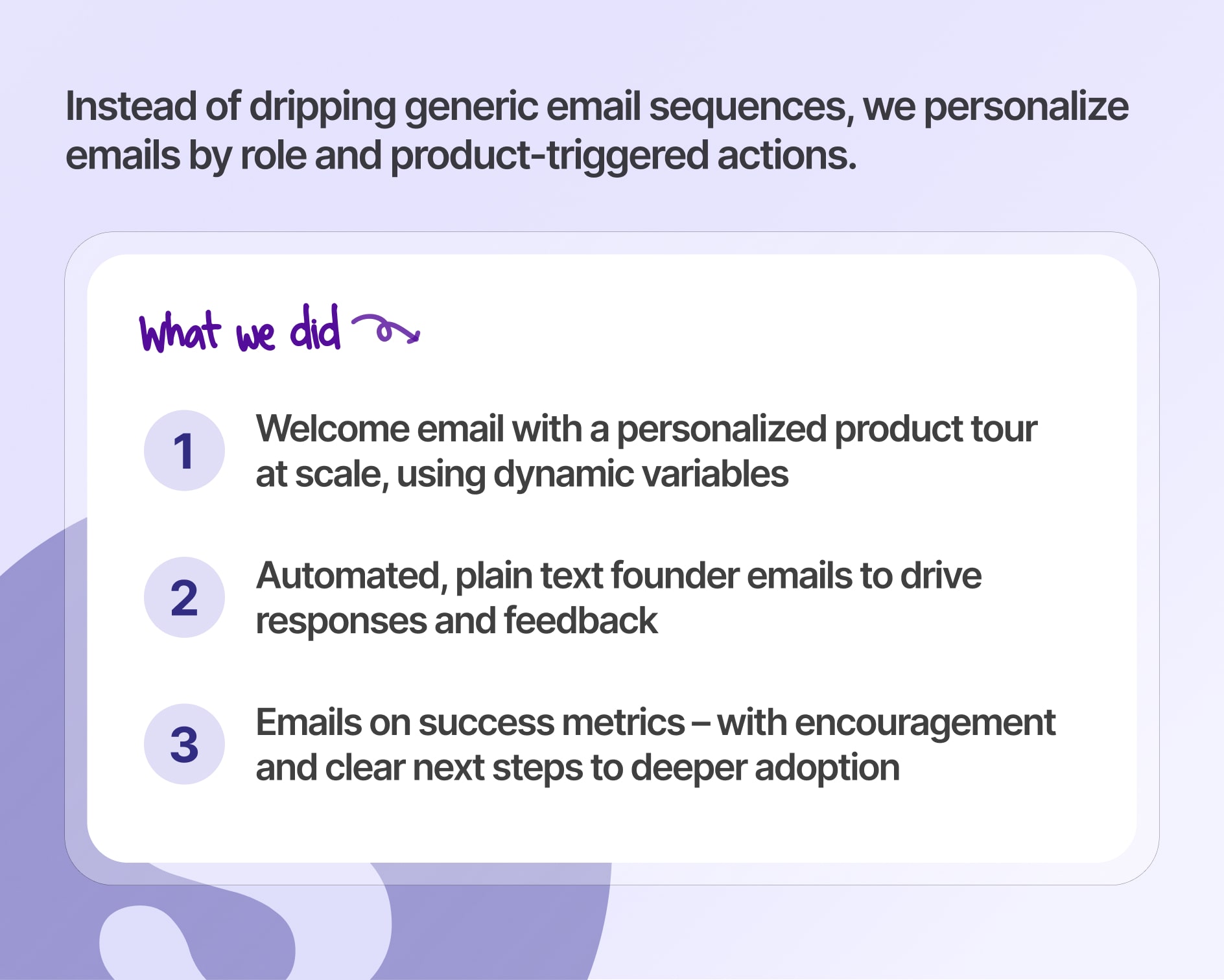
Instead of dripping a handful of generic email sequences to every signup, we decided to add some personalization through interactive demos and product-triggered onboarding emails. These include:
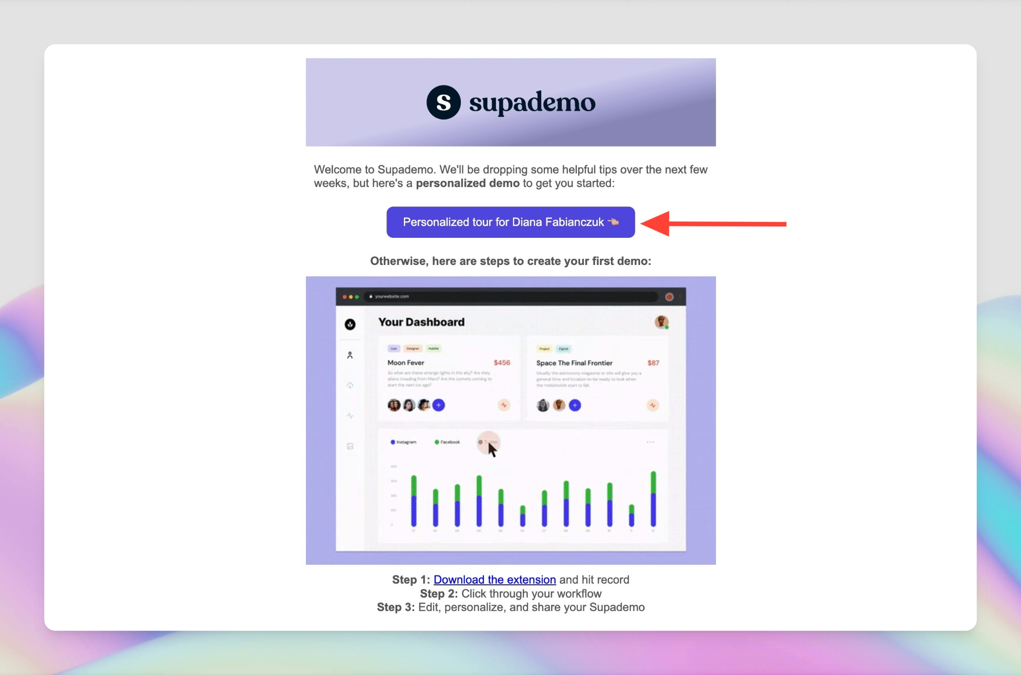
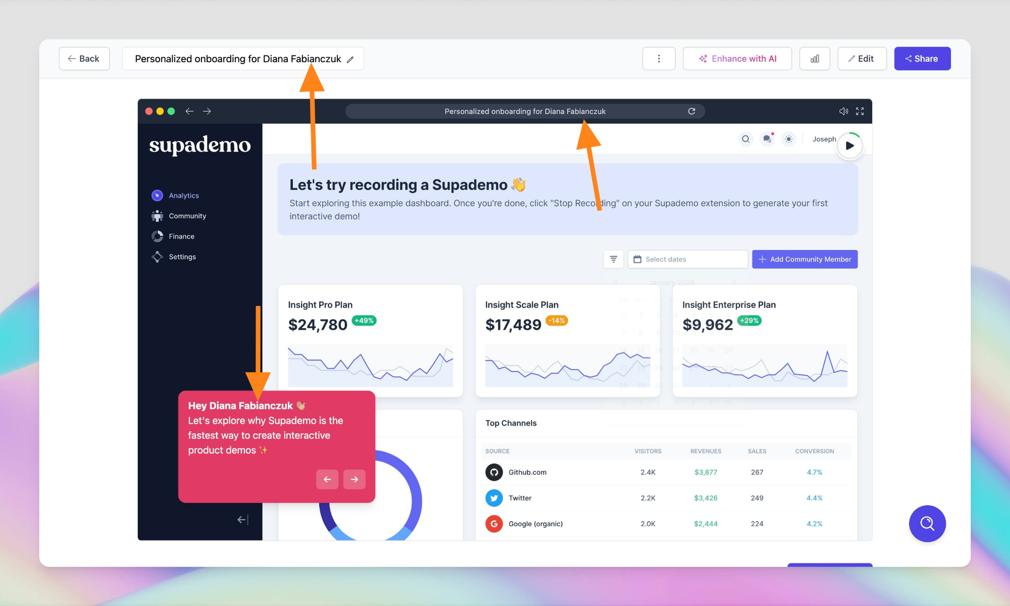
A) Welcome email with a personalized interactive product demo tourBy using a Supademo with dynamic variables, we're able to inject personalized interactive demos to our onboarding emails at scale – while receiving email notifications each time prospects view and engage with our Supademo.
This signal helps us direct manual efforts towards the most highly engaged, high potential signups.
B) A series of personal founder emailsIn addition to company-branded welcome emails, I send out a series of plain text founder emails to ask:
2. Offer to help get them started (Day 7)
3. Offer to help audit their Supademo's or co-create some together (2 months, only for paying customers)
I then personally read and respond to each email – creating an incredible channel for product feedback, market intelligence and relationship building.
C) Emails sent when success metrics are metWe send out a series of emails when users surpass certain thresholds – like creating their first Supademo, created more than 5 – all with encouragement and clear next steps to drive further adoption)
D) Weekly tips emailThat highlights one key feature they should know about. We keep this really brief (~2 sentences max) and purposely space them out so it's less intrusive and helps us stay top-of-mind.
It also increases the odds of catching users at the right time – especially folks who didn't quite finish onboarding due to a gap in timing or priority.
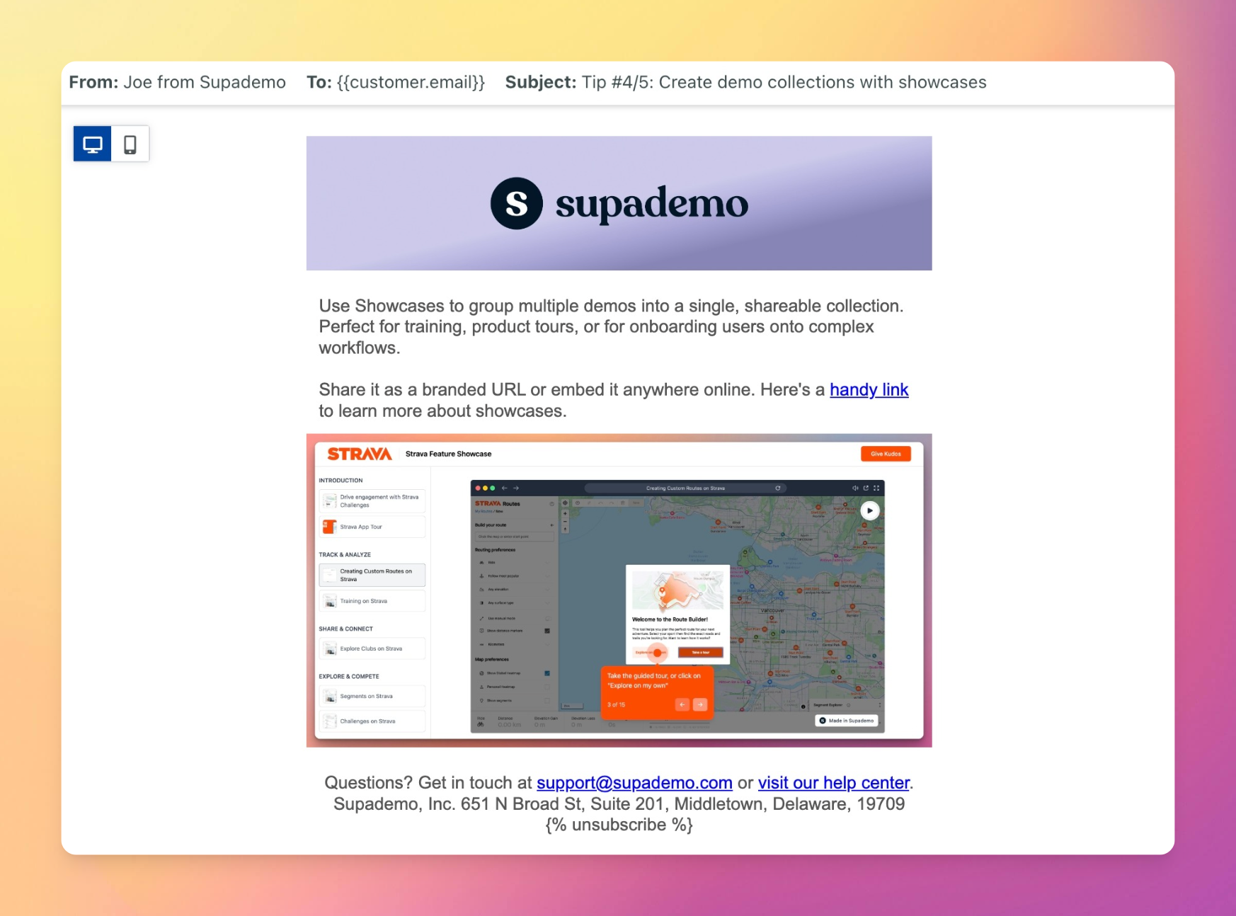
Ultimately, these personalized onboarding email sequences have helped us scale our customer touch points and nudge the right customers at the right time.
The Results: Comparing the before and after metrics
After implementing these tactics throughout our product onboarding, we made significant strides in our onboarding metrics.
When comparing metrics from February-April against April-May, we notably:
2️⃣ Achieved a 20% improvement in Activation Rate – measuring the rate of users who create a workspace, create a Supademo, and garner an external view. Nearly 50% of users activated.
3️⃣ Decreased the time it took for users to achieve Time-to-Value by 39% – cutting down this time to less than five hours.
4️⃣ Increased the Average Demo Per User Count by 37% – driving product stickiness and adoption.
These leading indicators also drove all-time highs for Supademo's created (25% MoM), multi-demo showcases (47% MoM), user signups (9% MoM) and recurring revenues (17% MoM).
Improvements we wanted but didn't get to...

While we're happy with these results, we know we still have lots of room for improvement. And like any other startup, Supademo operates on limited time and resources.
Here's a non-exhaustive list of tactics we wanted to get to and hope to implement in the future:
2. Let users record a Supademo without an account – helping them realize value up-front;
3. Add authentication options, including using their own password;
4. More personalized in-app product tours, interactive demos, tooltips by role, use-case, usage patterns;
5. Automatically personalizing the workspace theme based on their email domain or role;
6. Personalizing email sequences, example Supademo templates, or folders using the persona and choices selected during signup;
7. Ensuring invited teammates in queue (i.e. without admin approval) aren't blocked and can experience a temporary workspace;
In Conclusion
Onboarding is a craft that should constantly evolve alongside your product. It's an incredibly important – but often glossed over – part of determining top-line revenue, customer retention, and the health of your company.
We hope this comprehensive, practical guide helps inspire ways to improve the customer experience at your SaaS product. If you have any ideas or tips on how you've improved product onboarding at your company, I'm keen to learn from you.
Ready to start driving product onboarding? Create engaging interactive demos with Supademo or snap beautiful screenshots with Supa Screenshot – both for free.
Otherwise, follow along on the Supademo blog or connect with me on LinkedIn for my latest musings.

Joseph Lee
Co-founder and CEO at Supademo


